Tucked into Paris’s historic Left Bank, Atelier HA gives MELT a retro-futurist identity, pairing American diner nostalgia with bold, theatrical interiors
Photography by Axel Aurejac featuring Atelier HA
Among the historic streets surrounding the Panthéon, MELT’s latest Paris outpost might take on the familiar language of the American diner, but with a sexy, cinematic Parisian twist. Designed by local studio Atelier HA, the 2,700 sq ft multi-hyphenate venue stretches across three levels and is more of a neighbourhood canteen-cum-Texas smokehouse and late-night club than a classic French bistro.
It is the second collaboration between MELT’s founders and Atelier HA, following their first project on rue de Cambronne in the city’s 15th arrondissement. Rather than recreating a typical American diner, the brief called for a contemporary interpretation of its familiar visual language. ‘We really wanted to avoid the trap of thinking we need to literally reproduce all the codes of an American diner,’ explain the founders of Atelier HA, Hugo Vince and Adèle Nourry. ‘We kept some of the more classic, almost slightly kitsch elements, but tried to reinterpret them each time.’
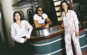
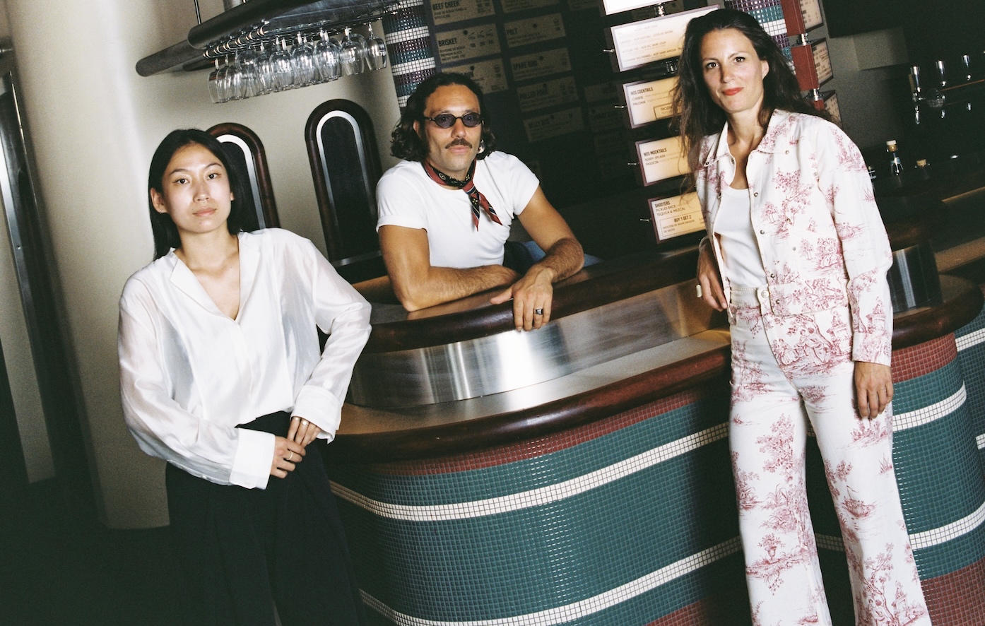
From the moment guests enter, the bar sets the tone. Sweeping in a gentle curve across the ground floor, it is clad in small-scale mosaic and brushed stainless steel, giving the room a natural focal point. Beyond the bar, the open kitchen remains deliberately in view, offering a glimpse of the preparation behind MELT’s brisket, ribs and house-made sausages.

Photography by Axel Aurejac
There are subtle nods to the designers’ references throughout the space. Glossy vinyl banquettes, for example, recall the saturated booths of midcentury American diners, but are rendered in chocolate, vanilla and black rather than the expected turquoise, giving the interior a richer, darker and more nocturnal feel.
‘We all have this image of the American diner with these large, often turquoise-blue booths,’ say Vince and Nourry. ‘Here, we wanted to take them somewhere else, towards something slightly darker. That’s why we chose to combine black and vanilla: the latter brings something very soft, almost indulgent, while the black pushes the space towards its more nocturnal identity and its club-like atmosphere.’
There is a recognisable Parisian touch to the American vocabulary, too. Hand-blown glass neon light, created with Alexis Néon, transports a touch of craftsmanship and Parisian brasserie into the mix, while mosaics add colour and a certain old-world playfulness. Stainless steel adds the functional feel of a canteen, while moss-green polished concrete gives the interior a more modern, almost industrial edge.

Photography by Axel Aurejac
The emphasis on materials allows MELT to feel familiar without becoming pastiche. The studio began with an imagined America of the 1970s and the 1980s, drawing on the visual language of the diner and the atmosphere of the Texas steakhouse, but then introduced references from cinema and science fiction.
Edward Hopper’s theatrical interiors informed the lighting and mood; Stanley Kubrick’s 2001: A Space Odyssey appears in the backlit arches and flashes of vivid red. The most persistent reference, however, is perhaps The Fifth Element, a favourite of the client and a film whose collision of everyday Americana with a futuristic world proved particularly useful to the designers.
‘We really liked the mix of familiar elements with a futuristic world, and tried to bring some of that into the rounded shapes, porthole windows and various details throughout the project,’ explain Vince and Nourry. ‘There are also a few references to Stanley Kubrick’s 2001: A Space Odyssey, particularly in the backlit arches and, in some areas, the use of vivid red light. Ultimately, we mixed all these different references: a 1970s–80s America combined with something more futuristic, almost Space Age, which helped us move away from an aesthetic that felt too purely vintage.’

Photography by Axel Aurejac
The colour palette brings a softer note to the otherwise industrial interior. Chocolate and vanilla vinyl soften the more industrial surfaces, while moss green anchors the concrete underfoot. Above, an ember-red ceiling introduces a more visceral note. Rather than opting for a smooth, polished finish, Atelier HA recreated a rough, almost seventies-style plaster texture and then saturated it in glossy red paint, reflecting the changing light of the ceiling as the day progresses.
‘The red ceiling was also very important,’ say the designers. ‘We recreated a rough, almost seventies-style textured plaster and then completely covered it in a vivid, glossy red paint. We liked the idea of taking a texture that could feel slightly dated and making it much more contemporary through colour and shine. Because the ceiling is so textured, it also catches the light beautifully and changes throughout the day.’
The material palette is equally assured. Vinyl, chrome and brushed stainless steel give the interior the polished, utilitarian quality of a classic diner and canteen, while concrete adds a more stripped-back, tactile quality. Together, the materials create a balance between polish, utility and rawness.

Photography by Axel Aurejac
‘These materials naturally reflect the different worlds we wanted to bring together,’ explain Vince and Nourry. ‘The glossy vinyl directly references the American diner, while chrome and brushed stainless steel evoke the canteen, a more industrial feel, and the world of American barbecue. The concrete brings something rawer and more contemporary to the space. More generally, materials and textures always play a very important role in our projects. Here, mixing materials that are quite emblematic of our different inspirations naturally shaped the overall design of the project.’
Several of the restaurant’s most unique features were designed specifically for the space. The bar, perhaps the most imposing of these, combines sweeping brushed-steel curves with a mosaic-clad base and was developed as a technically complex centrepiece. The banquettes were also designed in-house, along with the broad stainless-steel canopies that sit above them. Porthole cut-outs, bevelled mirrors and integrated backlighting continue the Spage Age references, while a mirrored mezzanine overlooking the kitchen changes the mood again.
‘The most important piece we designed entirely from scratch is definitely the bar,’ say Vince and Nourry. ‘It was quite technically complex, with these huge, very rounded countertops, curved brushed stainless steel and the mosaic pattern running along the lower part. It was an element we really enjoyed designing.’

Photography by Axel Aurejac featuring Adèle Nourry and Hugo Vince
‘We also designed all the banquettes and the large stainless-steel canopies above them, with their portholes, bevelled mirrors and integrated backlighting. Again, there is a subtle nod to The Fifth Element. We also created the mezzanine above the kitchen, entirely clad in mirrors. This time, the reference is more nocturnal, almost reminiscent of Pigalle and its nightlife – a world we particularly like, and one that echoes the club atmosphere we wanted the space to take on in the evening.’
Vintage pieces are used sparingly, with most of the interior made specifically for the project. The studio has relied on custom fabrication to reinterpret the look of recognisable mid-century designs, from re-editions of a vintage chair developed with an antique dealer to entirely new pieces elsewhere in the restaurant.
Outside, the original wooden facade has been transformed with graphic detailing and red neon. Set against the more traditional architecture of the neighbourhood, it gives MELT an almost spaceship-like feel on the street. ‘We really wanted guests to get a kind of visual rush from the moment they arrived,’ say Vince and Nourry.

Photography by Axel Aurejac
‘It starts before you even enter: we completely redesigned the wooden façade with large portholes and graphic elements that once again reference the spaceships in The Fifth Element, along with red neon lights that make the restaurant highly visible from the street, especially at night.’
‘Inside, we completely rethought the circulation so that the monumental bar is the first thing you see, as this is where you place your order at Melt. Right next to it, we lowered the floor to create the kitchen below, so as soon as you enter, you look down onto the chefs preparing the meats and dishes. It creates something very lively and immediately makes you hungry.’
The kitchen is central to the visitor experience, both visually and in the way the restaurant operates. Founded in Paris in 2016, the restaurant brought the culture of the Texas smokehouse to the French capital, cooking brisket, ribs and house-made sausages low and slow for up to fifteen hours. In the new space, the kitchen is fully visible, with the smoking, cooking and preparation taking place in full view of the dining room.

Photography by Axel Aurejac
‘We really wanted people to feel immersed in the world of MELT from the very first moment: the bar, the open kitchen, the lighting, and then all the mirrors that blur the perspectives and create this feeling of having a lot to take in visually,’ the designers add.
During the day, the concrete, stainless steel and open kitchen give MELT an informal quality, closer to a neighbourhood canteen than a traditional restaurant. The softer vinyl, colour and diner-style details keep it from feeling too austere. By evening, the balance changes. Red lighting becomes more pronounced, reflections catch across the stainless steel and darker surfaces come forward, giving the room a more intimate atmosphere.
All of these elements sit comfortably within a single interior, with Atelier HA allowing the mood to change through the day rather than dividing the restaurant into distinct zones. Diner booths, brasserie details, smokehouse materials, cinema lighting and nightclub touches come together without competing for attention.

Photography by Axel Aurejac
By the time the lights come up, the brisket has been smoking for hours and neon has taken over from daylight. The original references recede into the background, leaving a restaurant that feels warm, lively and cinematic, all wrapped up in the easy informality of a neighbourhood restaurant.
Get a curated collection of design and architecture news in your inbox by signing up to our ICON Weekly newsletter