
In 1931, modernist architect Le Corbusier devised an architectural colour palette for his radical designs, later extended in 1959. Inspired by this, Malin Glemme, founder of Swedish company Layered, has launched a new rug collection, La Palette 1931/1959, which takes a deep dive into intense colour

Photography by Mikael Lundblad
Words by Alia Akkam
Harmonious designs exude a certain visualprowess, and Malin Glemme has long been seduced by such
balanced compositions. ‘It’s interesting when there are different elements that contrast with each other, such as femininity and masculinity, or warm and cool,’ says the founder and creative director of Swedish interior design brand Layered. ‘It’s always been a theme for me.’
Charles-Édouard Jeanneret’s revolutionary architectural colour theory, then, immediately captivated Glemme when she began reading about its origins. The venerable Swiss-French architect and designer, best known as Le Corbusier, believed that hues were embedded with defined spatial functions and that they elicited specific emotions.
For him, colour transcended aesthetics, and its psychological capabilities played a central role in architecture. This philosophy is exemplified in Chandigarh, the utopian city he planned in northern India in 1953, and Unité d’Habitation, the sprawling Marseille housing complex, completed the year before that kicked off the brutalism movement.

Photography by Mikael Lundblad
As Glemme dived more deeply into the modernist’s Architectural Polychromy, a purposeful palette of 63 complementary shades that, when used in combination, yield distinctive architectural settings, it became clear that her thinking resembled his. It was this synergy that organically spawned La Palette 1931/1959, Layered’s newest assemblage of rugs.
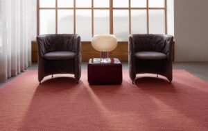
Handmade from wool, the four styles in Blue Claire, Red Ochre, Blue Fonce and Ruby Red are decidedly simple, each one unleashing a minimalist confidence in solid swathes of light and dark blue, as well as a meditative rusty red and rich burgundy. Together, they form a brilliant juxtaposition. Of the quartet, Glemme is especially taken with the intense ultramarine because ‘it expresses boldness. It’s the most energetic colour I can think of,’ she points out.

Photography by Mikael Lundblad
Le Corbusier’s colour system comprises two ranges organised into a series of moods. The first, which was developed in 1931, focuses on 43 muted, earthy tones, while the audacious 1959 follow-up illuminates 20 more shades that reflect depth and dynamism.
‘I thought it was nice to do a blue from the soft collection and a blue from the striking one,’ explains Glemme. ‘Le Corbusier picked his colours from natural pigments, like the terracotta and indigo that, when you look at architecture through the ages, has been with us forever. It’s beautiful when you can tie in historical referencing and add a new context to make it feel fresh again. That’s something I find intriguing and fascinating about this.’
With La Palette 1931/1959, Glemme intentionally wanted the rugs to look pared-back, to amplify the colours and stay true to Le Corbusier’s vision instead of cluttering them with the daring patterns that are plentiful in other Layered collections.

Photography by Mikael Lundblad
Like Le Corbusier’s colour schemes, the statement rugs are timeless, revealing an alluring sensibility that has guided Layered since Glemme launched it in 2015. La Palette 1931/1959 aptly coincides with this milestone celebration and speaks to Glemme’s continued dedication to craftsmanship.
Glemme was working as global section head and manager in the new development department at H&M’s global buying office when she moved into a 200 sq metre home on a restricted budget. All searches for a beguiling yet affordable rug were fruitless, and a frustrated Glemme, tapping into her background in fashion, ultimately designed a sustainable one of her own. ‘I couldn’t find a rug that appealed to me, but I had so many ideas,’ she recalls. Finally, she settled on one culled from Byzantine-era architectural drawings. Brought to life in Bhadohi, India, it was at once classic and modern.
She had thought that dreaming up a rug was merely a practical move for someone artistic, cash-strapped
and resourceful, but the hand-woven creation unleashed a fervour that changed her career trajectory. Featured in the Swedish interior design magazine Sköna hem, it prompted enthralled readers to reach out, asking how they could purchase one for themselves. This was the impetus behind Layered, producing rugs (the wool ones are still made in India; the shaggy ones in Greece) with 100% natural or recycled materials, eventually alongside furniture, blankets and cushions.

Photography by Mikael Lundblad
Just prior to La Palette 1931/1959’s arrival, Layered unveiled 10 Years Unfolded, a trifecta of reinterpreted Layered originals. Illusion, which takes cues from Persian art and architecture, was part of the inaugural collection. Triangle, which calls to mind geometric blocks, and the graphic, labyrinthine Letters debuted a year later. All still have resonance today, but were updated with colours like teal, ochre and mulberry.
‘We went back to the archive because so much has happened during these years. There are so many shapes, textures and colours now, and it’s fun to look at the originals,’ Glemme says. ‘Do they still feel contemporary?’

Photography by Mikael Lundblad
In 2024, Glemme bolstered Layered with Pick a Poppy, specialising in ceramics and tableware handmade in India and Portugal, and it’s only expanded her appreciation for elevated everyday living.
‘When I do all the designs for Layered rugs, I have imaginary homes in my mind. This is the customer, and this is what the house should look like,’ Glemme elaborates. ‘A rug needs to fit into a space, but it also has to have a bit of nerve, something unexpected.’
Get a curated collection of design and architecture news in your inbox by signing up to our ICON Weekly newsletter