words Justin McGuirk
The Design Museum could be seen to be making a point in changing its award scheme from Designer of the Year to the Brit Insurance Designs of the Year. As we become more and more critical of (if no less in thrall to) personality culture, the switch is very much on message: things, not people. But is this the first step towards the anti-celebrity reformation? A quick look at the nominees in the furniture category reveals that the power of names is undiminished: Philippe Starck, Ron Arad, Thomas Heatherwick, the Campana brothers, the Bouroullec brothers… the usual suspects.
Whatever one thought of the previous format, it had its advantages, like the fact that it was a constant source of controversy. Penguin books, the Guardian newspaper, “design strategist” Hillary Cottam and illustrator Jamie Hewlett all came in for some form of criticism as nominees (chiefly, “not a designer”). And the four-candidate shortlist was also a set-up that we, as a betting nation, associated with excitement: the four-horse race, winner takes all.
The Brit Insurance Designs of the Year is about as controversial as a bowl of Weetabix. That’s partly because it is so inclusive – 100 designs across seven categories, from fashion to transport. It’s a Reader’s Digest version of the last year in design, which is arguably quite a useful thing for punters to see, but such a broad spectrum of work avoids all the risk. It feels inconsequential, in the architecture category, to have SANAA’s New Museum slugging it out against Herzog and De Meuron’s Olympic stadium in Beijing (the winner).
The very fact these two great buildings are on the shortlist is symptomatic of the same international consensus that characterises the furniture selection. This is the inevitable drawback of giving what was a British award – the design world’s Turner Prize – a global remit.
In this context, it was refreshing to find Titus Nemeth’s Nassim typeface, which can be used in both the Arabic and Roman alphabets, as it was one of the very few works by an unknown (Nemeth designed it as a Masters student). In places, you had big names attached to bad work, like Peter Saville’s distinctly dodgy logo for Kate Moss’ fashion range. There were also a few anomalies: has anyone figured out how Issey Miyake managed to get away with nominating his own label’s Spring/Summer 08 collection?
There was, to be fair, one tiny note of contention. If the extension of London’s Congestion Charge zone is a design then the appropriation of the word by bureaucrats has gone further than we thought. Otherwise, a consensus of sorts reigned. No one could quibble with the crowd-pleasing overall winner, Yves Béhar’s One Laptop Per Child computer.
It all tallies with the now established style of Deyan Sudjic’s directorship of the Design Museum. “Safe” and “popular” are Sudjic’s watchwords, as he has proved with big-name retrospective after big-name retrospective (next up is Richard Rogers). His agenda is not to provoke or to question, it is to get as much foot traffic through this awkwardly located museum as he possibly can. And who can blame him for that? But a month from now, you won’t be talking about who won the Brit Insurance Designs of the Year.
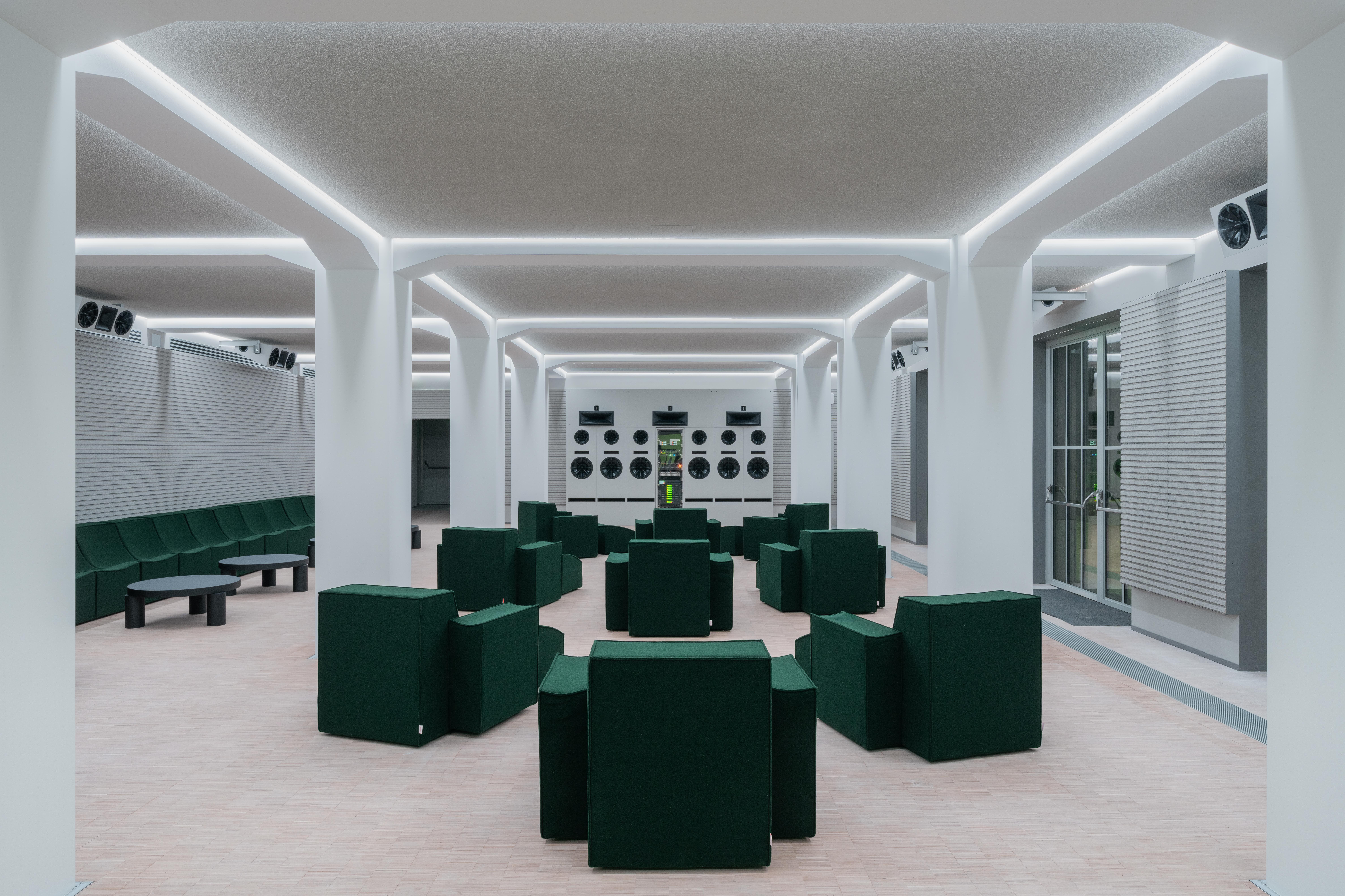
top image Herzog & de Meuron’s National Stadium, Beijing

Yves Béhar’s One Laptop Per Child (the overall winner)
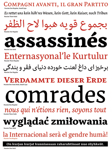
Titus Nemeth’s Nassim typeface
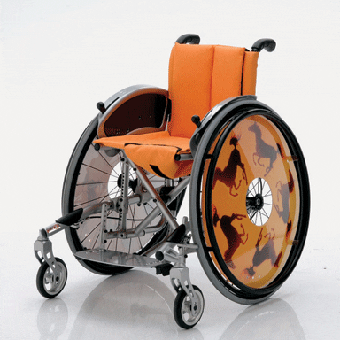
Meyra Ortopedia’s Mex-x wheelchair for children


