words Sophie Lovell
A deafening barrage of heavy artillery fire interspersed with the crackle of machine guns fills the air around the Bergen-Belsen Memorial.The scrubby heath landscape of the Lüneberger Heide region can be dour at the best of times, but in the weak winter light under a rain-bloated sky in early December it is downright foreboding. And with a NATO artillery range full of British troops on manoeuvres directly adjacent to the former Nazi POW and concentration camp, the past and present are colliding uncomfortably.
In places like Bergen-Belsen, where over 70,000 people lost their lives (including the 15-year-old Anne Frank and her sister Margot), the lingering aura of past events seems to make time slow and thicken. The new documentation and information centre by German practice KSP Engel and Zimmermann is all about memory. Its reduced sculptural form, restrained and unadorned surfaces and studied relationship between positive and negative space is not only about being a vessel for narrative. It also demonstrates how contemporary German architecture is responding to its social, political and documentary role. Comparable recent projects include HG Merz’s award-winning Station Z at the Sachsenhausen concentration camp in 2005, and the visitor centre by Lorch + Hirsch at the camp at Ravensbrück in 2007.
For highly sensitive sites such as these, an architecture of consensus and collaboration is required, but transparency and neutrality seem to have also become part of the language. Merz’s approach was to use a translucent, teflon-coated fabric stretched over a white cube fixed lightly to the ground above the ruins of the cremation ovens. Lorch + Hirsch too used a form based on a cuboid that partly hovers above the site, this time with translucent glass wall elements. Both are abstract and rather alien shells, yet permeable to their environment, and seeking as little physical contact with their sites as possible. The Bergen-Belsen documentation centre pursues similar strategies.
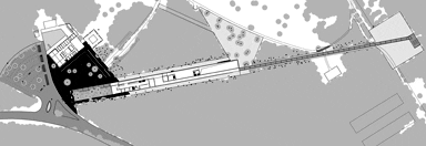
The commission was split between KSP and a landscaping proposal by Berlin-based firm Sinai Exteriors. Sinai’s masterplan for the site involved reinstating the topography of the former camp by thinning the trees and vegetation to make its historical components “visible again”. This included creating a new forecourt at the entrance and reinstating the old paths and roads throughout the location. One of these roads used to be the main route between two local villages, cut off when the camp was originally built. Sinai took this road and made it the key axis to the site once again, renaming it the “steinerne weg” or “stony path”.
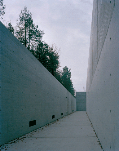
KSP also dwelt on the significance of the stony path; its 18m by 200m building is stretched along it. The path doglegs through the whole structure, cutting into the volume at the entrance and pulling you out at the back into the woods towards a clearing that used to be the camp parade ground. It was this focus on the path that allowed such a successful late marriage of Sinai and KSP’s concepts.
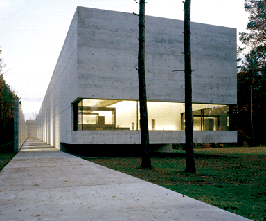
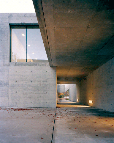
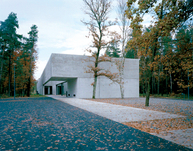
The documentation centre itself is a two-storey, exposed concrete building. It is massive, minimal, sober and totally free of curves, but the interplay of volumes is enough to give it just a touch of sculptural beauty. The stony path (which is in fact a long line of smooth concrete plates) passes along the glass-walled side of the reception area and disappears into the building. Here visitors can choose whether to continue straight into the building and the exhibition itself, or turn right into a high-walled courtyard devoid of any detail apart from a brace of rather unnerving security cameras.
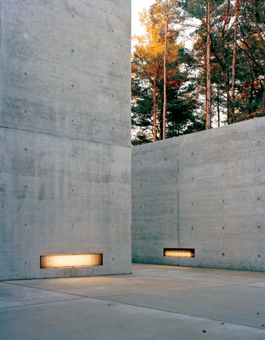
This moment of discomfort is relieved somewhat when the visitor turns the next corner and sees the long stretch of path heading into the woodland beyond. But there are still double-height concrete walls standing sentry for the next 100m before you’re released from their dominating (or perhaps protective?) presence into the site itself. “The task for us was to visualise, or reveal, the history of the place,” says KSP project architect Konstanze Beelitz. “Because of how the building is situated and where the openings have been placed, it achieves a very specific understanding of the site.”
If instead of following the path the visitor chooses to enter the building, a second carefully engineered irritation becomes apparent in that the floor slopes slowly upwards as you progress through the interior. The reason for this uphill journey is again symbolic. The building makes discomfort part of its topography, but it references the site at the same time as it defers to it – its contact with the ground ends exactly at the border of the former camp. The last ten metres are cantilevered out over the earth, hovering above it. This is the building’s most symbolic gesture. It appears to be straining to hold its static mass away from the actual site of so much suffering – like a long low bow to the victims, held interminably. A large glazed area cuts into the concrete volume to allow a panorama view across the camp’s ground, from the eerily beautiful silver birch trunks and mossy forest floor in the foreground to the flattened hillocks in the distance, which are the mass graves where thousands of mostly unknown victims of the Nazi atrocities are buried.
The permanent exhibition inside the centre was designed by architect and set designer Hans Dieter Schaal. He has done a great job balancing the restraint of the architecture, and the exhibition design allows space and time for visitors to digest as much or as little as they feel able. There are no shock tactics and there are numerous opportunities to look back through the building or onto the woods from windows and internal balconies. Like filmic devices – Beelitz calls them “cuts” – these openings permit a change of scene that reduces the claustrophobia caused by the intensity of the subject matter. You are not forced to take one particular route, but allowed to choose, to go back or – particularly in the case of the double-height central tower where harrowing documentary footage is screened – not to enter at all.
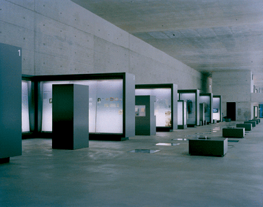
Schaal’s exhibition concept presents the subject matter with such restraint you are barely aware of the designer’s presence. Beelitz explains that, as with the landscaping, the collaboration here was also close: “We were constantly discussing and exchanging ideas to ensure that all the furniture spoke the same language – having no materiality in itself and just comprising abstract bodies.” Beelitz says she spent many, many hours on the detailing of
the interior, reducing every unnecessary or potentially distracting element – and it shows.
This issue of materiality is something that applies to the structure of the building as well – the idea that it should function as a neutral vessel, as an “archive of memory”, is often reiterated by the architects. In their view this is achieved by a reduced palate of colours and forms as well as materials: glass, concrete and steel.
“The building needs to be as free from association as possible,” says Beelitz. “Of course it takes a clear position in relation to the place, but the actual history is visible in the exhibition. The history should not be visible through the materiality of the building. It would not work as a metaphor.” And it’s true – the thought of trying to be playful or clever in the way of, say, Daniel Libeskind’s Jewish Museum, would be appalling in this context.
Where the building’s neutrality is perhaps less clear is in the use of exposed concrete. Beelitz sees it as the perfect material for this kind of building because “it is a poured mass with which you create space and volume, like sculpture. It doesn’t make any kind of statement – it has no material metaphor”. Although it would be hard to imagine a more appropriate material in this case, she is wrong about the lack of metaphor. Criticism of the building, where there has been any, has centred on the brutally functional associations that concrete has for many – especially older visitors. Dr Peter Fischer, member of the Jewish Council in Germany in charge of memorials, describes the concrete as having a “martialist” quality, but he welcomes the way the building “represents a break with the location and the landscape that offers a lot of space for interpretation”. And, as Fischer points out, “the earlier architecture on this site was a cemetery architecture, and that this building has broken with that is a good thing”. Like those of HG Merz and Lorch + Hirsch, KSP’s contribution to the ongoing memorial dialogue in Germany is refreshingly “sachlich” – it is what it is and does what it is supposed to do, and manages to be beautiful with it.
images Klemens Ortmeyer
