|
|
||
|
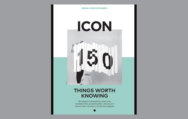
For our 150th issue, available until next week, experts from some of our favourite graphic design studios and magazines told us about the fonts that have stood out for them in recent years
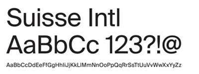
Suisse Intl by Swiss Typefaces Suisse is a really well-drawn typeface that comes in 53 different styles, including serif and monospace versions. Its Intl (international) style works incredibly well for text, but is also very effective when set at large point sizes for headings.
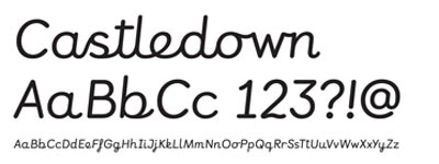
Castledown by Colophon Colophon’s Castledown – which was designed in 2012 for a primary school – shows perfectly the essential role typography can play in improving some of our most important environments.
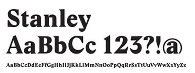
Stanley by Ludovic Balland Released in 2012, Stanley is inspired by Times New Roman. It has wide and sharp counter forms, as well as short ascenders and descenders. It features graphic shapes and, in a range of cuts, performs well in many applications.
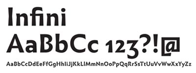
Infini by Sandrine Nugue Infini embodies two trends in 21st-century type: the rise in female designers and the renaissance of French type design. Nugue captures spontaneity and movement in what are normally static letters.
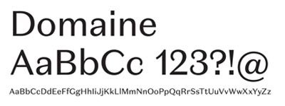
Domaine by Klim Type Foundry A beautiful, extensive face with 46 styles. As Kris Sowersby from Klim Type Foundry describes it, “To sum up Domaine’s style: contemporary, curvaceous Latin detailing on a Scotch skeleton”. Agree? Disagree? Tell us on Twitter using the handle @iconeye These five typefaces are 76-80 of the 150 Things Worth Knowing – a 16-page special supplement (pictured below) contained within our 150th issue. Click on the supplement cover to read the online version of the magazine or read more Things Worth Knowing using these links: – 20 DESIGN WORDS YOU SHOULD NEVER USE |
Words Icon |
|

