
|
|
||
|
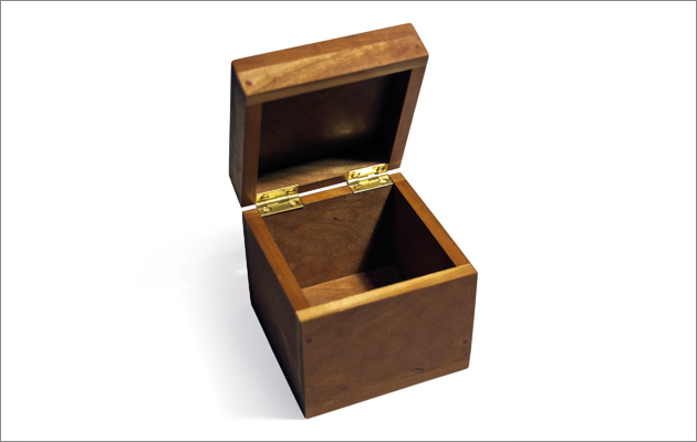
The Microsoft designer started out creating furniture, and is drawn to the space where making overlaps with technology. He told us about his five favourite objects Although I work at Microsoft, designing complex technological devices and the interfaces for people to use them, I started out making furniture. I’m drawn to the space where making overlaps with technology and information, and how beautiful this can be. My background in making and materials is an enduring influence, and I think this is reflected in these five objects. Cubic Hand Box The Creative Education Trust asked me to think of something that would help to promote making in secondary schools. The result is the Cubic Hand Box, a 4in x 4in x 4in box, fabricated from 3/8in cherry wood. It’s a simple object that can be made in a school workshop, introducing students to the basic grammar of making in wood: face side and edge, planing to width, cutting to length and so on. Making it centres around hand tools and processes, yet it’s not intended to be traditional, but to sit alongside processes such as CNC machining and 3D printing.
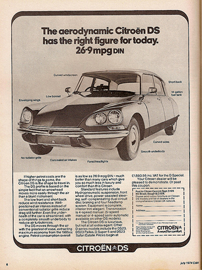
Citroën DS If I have to choose a car – and it’s hard not to – I would choose the DS. It’s a vehicle from a different age, when peak oil was no one’s concern and some brilliant engineers showed the world just what could be achieved in technical mastery of the motor car. There hasn’t been anything quite like it since.
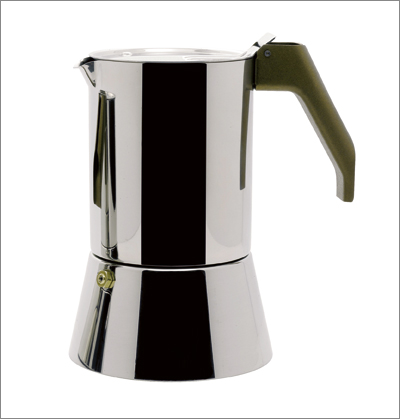
Alessi coffee maker I bought one of these in Milan many years ago when I was a student. It’s such a lovely thing to use, and in our house we use it every day. I love the way it differs from a Bialetti in a manner that is so true to its material; the difference between making with cast aluminium and forming stainless steel.
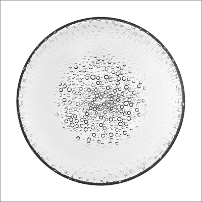
250mm Ultima Thule plate I have long been inspired by this great Finnish designer, who noted that “all materials have their own unwritten laws”. His craft objects are beautiful. This glass plate illustrates how he had such empathy with the nature of the materials he worked with. He had a sensitivity towards
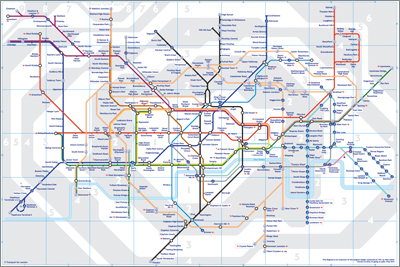
London Underground map I love maps, and this is one of the greatest. I like the way the intersections are more important than the distances between stations, and how this reflects the accessibility of the city’s transport system. The map was a radical notion at the time Beck designed it, and it struggled to be accepted, as all bold ideas do. I especially like the background tonality pattern made by the zone shading. |
Words Peter Griffith |
|
|
||