|
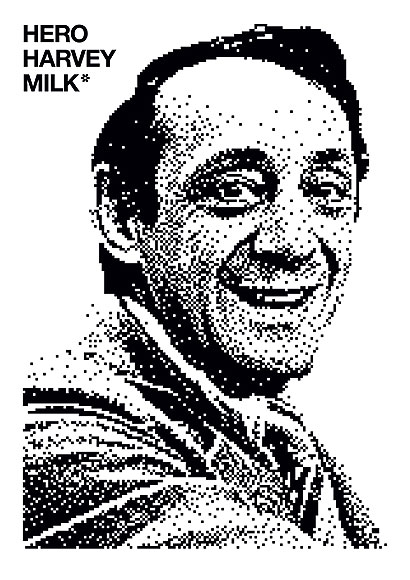
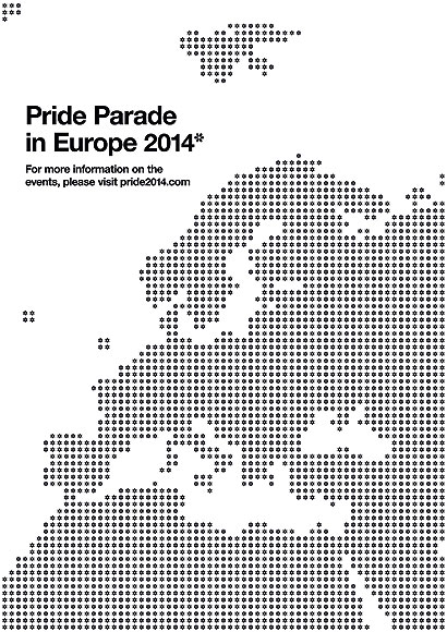
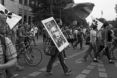
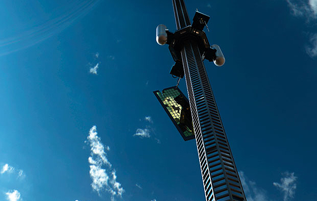
Swedish studio Lundgren+Lindqvist’s emblem is firmly rooted in the LGBT community’s history but can be used in virtually any situation – it even works as a punctuation mark While we recognise the enormous value and rich history of the rainbow flag, we have come to realise, through discussions with close friends in the LGBT (HBTQ in Swedish) community, that there is need for a companion: a symbol that is free from both the technical demands posed by the reproduction of the flag and the oppressive origin of the pink triangle, which derives from Nazi concentration camps. We wanted to see if we could create an icon that would work in one colour or black and white. For every diverse group, expressing opinions and beliefs through demonstrations and grass-roots movements, the ability to produce material quickly and cheaply is vital. From tote bags, photocopied posters and hand-painted placards to black-and-white photographs in the daily newspapers, the revolution needs to be as prominent in black and white as it is in full colour. During our initial research, we quickly realised the scale of the challenge we had taken on. Not only is the HBTQ community extremely diverse, including a host of sub-groups, it is also a community that has been using a multitude of symbols over the years. We also felt a weight of responsibility to give the task With the rainbow being such a prominent and well-known symbol, we decided to use it as our starting point. This led us to look deeper into chromatology and light. In a traditional spectrum wheel, the overlapping areas of six circles create a flower-like shape. This shape, with its six rhombus-like leafs corresponding to the number The flower’s strength as a symbol is its universal appeal. It is impossible to find a culture on earth that does not embrace and celebrate the flower. They break through the concrete pavements of our cities and are presented in celebration of good deeds and love. Throughout the ages, the flower has also been adopted in different forms by gay men and women. Victorian men would often pin a green carnation on the lapel of their jackets, while lesbians used to give violets to women they desired. In Athenian society, a hyacinth was used to represent the younger partner in homosexual couples. Using the overlapping areas from the spectrum wheel as the basis of our design, each leaf was shortened, using concentric circles, in order to give the symbol a sharper, more distinguished form. We felt that One of the strengths of the symbol lies in its application. By using it as an asterisk, the symbol can be applied to almost anything – it could be attached to a logotype to show that a bar is HBTQ friendly, for example, or used in guerrilla marketing by hijacking images, brands and signs in the streets. By wearing the symbol as a pin, you will automatically place an asterisk on yourself saying that you support the HBTQ community. The asterisk also illustrates the fact that there is often more to a story than immediately meets the eye. As with any symbol, its strength will grow by association.
As an asterisk, the symbol can be applied to a range of visual material
|
Words and images Lundgren+Lindqvist
|
|
|
||
|
The idea evolved from the rainbow flag and colour spectrum wheel |
||

