|
Catalonia, in north-eastern Spain, has some of the best wines in the world. But after looking a little we realised that there were various names of wines from each producing area, but no unique brand to convey the personality of these wines and give them a powerful, global and exportable identity. For this reason, and because the attributes of Catalonian wines are, among others, variety, uniqueness, creativity, quality and excellence, we decided to work on a graphic system to create an innovative brand identity for Catalan wines and help them attain a visible, graphic-identified presence.
The brand
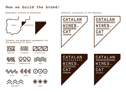
We started from the idea of “terroir”, a French concept that refers to the natural characteristics of a specific area that affect the personality of each wine. The parameters are climate (rain, humidity, temperature) and soil (minerals, structure, location). These elements, combined with the grape varieties of each region and their cultivation and treatment, provide the variety and richness of the Catalan wines.

Wines
We translated this idea into icons that represent each parameter of the climate and the soil condition, combined in the geographical shape of Catalonia and its name. We can design multiple identities with these combinations. The font used is Akkurat Mono and the colour is taken directly from the terrain.
The label
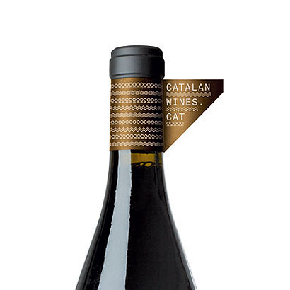
We were looking for a label that could be combined with the identity of each bottle, without harming the existing packaging. We decided that an easy way to identify the wines of Catalonia was by an adhesive ring at the top of the bottle.

The packaging
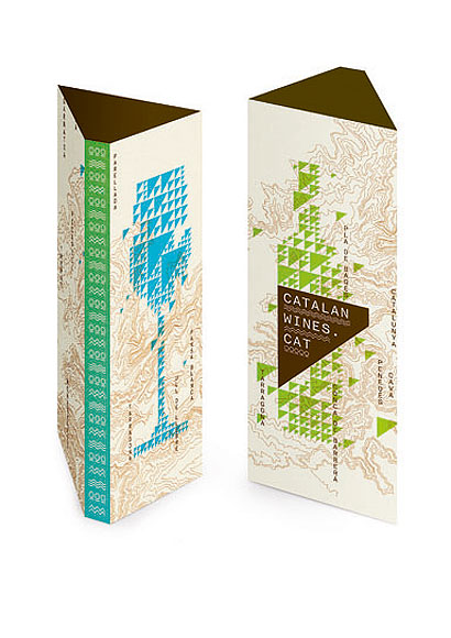
We created a triangular packaging carton for the wine bottles that has the graphic branding on it.

The posters
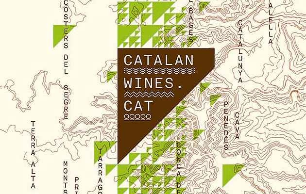
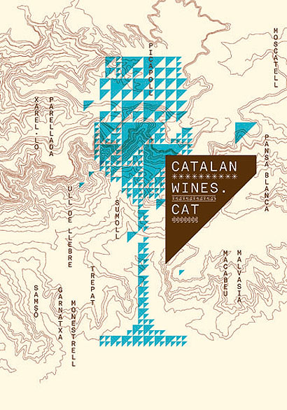
We’ve designed two posters that explain in a graphic way two ideas: the first shows the 12 different Catalan regions; the second has a list of the autochthon grape varieties. In the background is a real map of the Catalan region and its reliefs.

|
|
Image
Toormix
Words
Toormix
|

