|
|
||
|
Last year, after just over ten years of ownership by BMW, the two-millionth Mini was driven off of its Oxfordshire plant by prime minister David Cameron. In 2012 alone, Mini produced 216,302 vehicles, exporting to more than 90 countries around the globe. Even the biggest names in today’s design world rarely approach the scales of production regularly achieved by global car manufacturers. Given the relative anonymity of designers in the automotive industry, however, it’s hardly surprising that car companies are wont to team up with design icons to boost a brand’s sex appeal. What is surprising, given the strength of automotive mass production, is that such collaborations often result merely in a single showpiece. When BMW Group’s head of design, Adrian van Hooydonk, approached husband-and-wife design duo, Stefan Scholten and Carole Baijings, about a potential project they had no idea what they were in for. “Van Hooydonk got in touch with us,” Scholten explains, “and it was strange because he didn’t ask for anything, he just invited us to come to Munich.” “We didn’t know whether we should prepare something,” Baijings says, “but we couldn’t stand it, so one week before we were supposed to go we asked them to tell us something about the project so we could prepare for the meeting.”
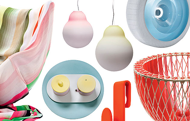
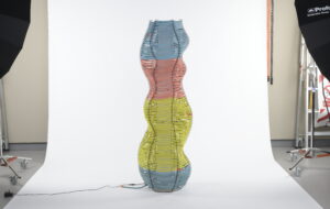
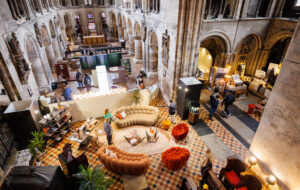
The project turned out to be a collaboration with Italian magazine Interni and Mini for the 2012 Milan Furniture Fair. BMW gave the Dutch designers complete creative freedom to design an installation – as well as a tour of the factory. “It was amazing,” Scholten says. “There was a top secret bit in the middle, which I can’t tell you about.” “It was so interesting,” he says of a concept car they saw at the factory. “For us, a concept can be a sketch, a paper model or an imaginary study, but ‘concept’ in BMW-world means fully prototyping a car that’s ready to drive with all the details. That’s not a concept car – it’s a real car.” By the time they returned to the studio, Scholten and Baijings had worked out a plan inspired by the concept car. Back in the studio, they got straight to work dissecting their own Mini. “We had the car right there,” Baijings says, pointing to a corner of their pristine studio full of artful displays of work past and present. It’s difficult to imagine a Mini or any car in this serene space. When automotive companies collaborate with industrial or fashion designers, the brief often asks for little more than window dressing or sleight of hand – a lick of fancy paint, a bit of Liberty print on the interior or a geometric-print body wrap – while the body of the car remains the same. But Scholten and Baijings are too impish, too curious, too economically-savvy for such an approach. Instead, like children smashing open a radio to understand its inner mysteries, the duo set about deconstructing the automobile in its entirety. Knowing that their Mini installation need not adhere to safety standards or even function as a drivable vehicle, Scholten and Baijings carried out an elaborate process of dissection and observation. Approaching the project with their typical back-to-basics approach, they asked why the wheels needed to be so complex. Why couldn’t they be made in one process, in one piece, using a transparent synthetic material for the central element and rubber for the tyres, for example? They asked why windows needed to be clear to allow for “views”. Why couldn’t they come pre-painted with their own views? Why did only the driver get an interface? Like TV screens in the back seats, why not provide each passenger with their own interface? The finished representation, displayed at the fair, was Colour One, or what they decided to call their “conceptual concept car”. As far from something just off a production line as possible, Scholten and Baijings’s Mini had been disassembled, re-imagined and then laid out as if waiting for some enterprising type to come and put the whole thing back together again, and drive out of the exhibition. The firm’s signature approach to design was also in plain view: lots of colour. Perhaps more than any other designer working today, Scholten & Baijings is renowned for its precise and surprising use of colour. The vivid flashes of orange, pink, yellow, blue and green that appear and reappear throughout the practice’s body of work are as recognisably Scholten & Baijings as parametric curves are to Zaha Hadid. While some have dismissed the pair as mere colourists, as their profile rises such criticisms are decreasing.
Unlike Scholten & Baijings, many designers today tend to shy away from colour, preferring instead the natural palette of stone, steel and wood. Perhaps this is a hangover from modernism, a cultural aesthetic descended from the pristine, white-marble of the ancient world, under which ornamentation – and, hence, colour – was a dirty word. If only we knew earlier what we know now – that most of these white marble majesties were positively drowning in colour. There’s something unique about Scholten and Baijings’ approach. In their hands, colour becomes more pliable, more workable – more colourful. Just as certain chefs are able to put together ingredients in a more spectacular way than others, Scholten and Baijings are more skilled than the rest in mixing colours. Their recent collaboration with 1616 / Arita Japan demonstrates this. Arita is one of Japan’s oldest and most renowned porcelain manufacturers. Its creative director, Teruhiro Yanagihara, spotted Scholten and Baijings’ work in Milan in 2009, and asked them to create a collection of tableware. The resulting collection, Colour Porcelain, includes plates, cups, bowls, serving platters and a tea set, and has been produced in three series – Minimal, Colourful and Extraordinary. The titles refer to the amount of colour, detail and pattern used in each range. The collection for Arita was a challenge for Scholten and Baijings, as they were bringing their signature colourful style to an industry with a historic reliance on artificial whiteness. “When we were making our Paper Porcelain collection, we wanted to match the colour of the porcelain to our cardboard models,” Baijings says. “But Japanese manufacturers suspend huge magnets over the clay mixture to remove iron and other impurities, which results in the classic, white porcelain colour.”
Scholten & Baijings convinced Arita to retain the natural porcelain colour, a delicate grey-white hue that formed the basis for the addition of specially developed glazes. Inspired both by Arita’s back catalogue and by new combinations of traditional Japanese colours sourced from local historical pieces, the Colour Porcelain collection features a vivid range of aquarelle-blue, light green, red-orange and yellow ochre. “In Japan when you want to do something difficult or unusual they say, ‘that’s very difficult’, then they find a way to do it,” Baijings says, reflecting on their experience working with Japanese companies. “In Europe, they say, ‘that’s very difficult’, then they don’t do it. It’s nice to get to know what ‘difficult’ means in different countries.” Scholten and Baijings push manufacturers to ensure the best quality in their finished products. “Working with the best companies helps to take us to the next level as designers,” Scholten says. This attitude has resulted in them creating a wide array of products for consumers at all levels of the market. Far from the one-off showmanship of the Mini conceptual concept car, Scholten and Baijings make things that people want and buy – beautiful pieces for domestic use, for a relatively everyday audience.
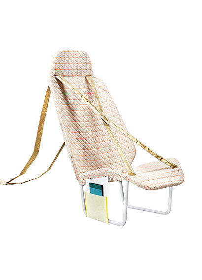
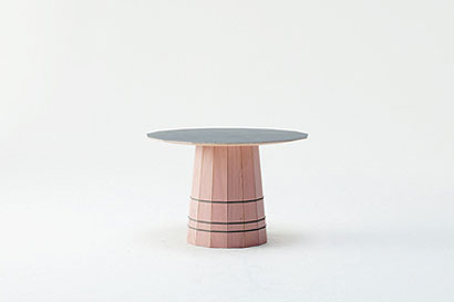
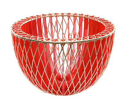
A full dinner set of porcelain from Arita would probably breaking the budget for most people, but Scholten and Baijings’ frequent collaborations with Danish-brand Hay mean that you can furnish your bed with a Scholten & Baijings’ Colour Block duvet cover or put a Scholten & Baijings Colour Carpet rug on the living-room floor for the same price as a similar product from Habitat. Even at this level – the pricier end of the mass-market – Scholten and Baijings take painstaking care to ensure that the colours in their products are perfect. Walking on to Hay’s stand at this year’s Stockholm Furniture Fair, the Scholten & Baijings pieces stood out from across the hall: the bright blues and orange striped in plaids and rows across cotton dishcloths and pillowcases. “A lot of people find colour difficult,” Scholten explains. “You need a lot of skill to manufacture it – it’s not only spray paint, but dye and pigments, the life of a colour, its fastness. Sometimes we see someone try to copy one of our designs, but we know how difficult it is, because we dye our own yarns and we know how to mix our own colours. We found out that we’re just really good at colour and through practising we get better and better.” Baijings looks thoughtfully at one of the samples in their office before adding: “A lot of manufacturers we work with say things like, ‘just put a bit of fluorescent colour in there’, but it doesn’t always work. It has to be the right colour for the design. We make compositions instead of making people choose a colour. People choose a mood, a tone, a feeling – not a colour. That’s one of the differences in how we work with colours.” From mass-market goods to high-end, one-off concepts, Scholten and Baijings have found work at all points on the manufacturing spectrum.
“We’ve been fortunate,” Baijings says, “because we’ve worked for a number of different manufacturers on a variety of scales in different industries for all different types of clients and customers. We learn a lot from each of the manufacturers, because they all have different skills and experiences, but equally we can offer a totally different method of working, a different way of thinking.” Scholten chips in: “Exactly. Like with BMW, if you’re not educated in a certain way you don’t know where to start. And often, we don’t know where to start either, but we just start. We’re learning as we go, learning on the job.” “Although we probably need to learn to say no to work,” Baijings says, “because we always say yes.” |
Image Inga Powillet, Takumi Ota, Scholten & Baijings, 2012/Mini
Words Crystal Bennes |
|
|
||

