
|
|
||
|
Launched at Milan Furniture Fair, the French brothers’ latest furniture collection for Vitra is based on a slim, black plastic frame, inspired by an ultralight serif font This year’s furniture fair showed signs of the industry returning to good health, with several power brands teaming up with major designers on new launches. We spoke to the Bouroullec brothers about their collection for Vitra.
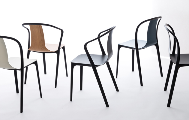
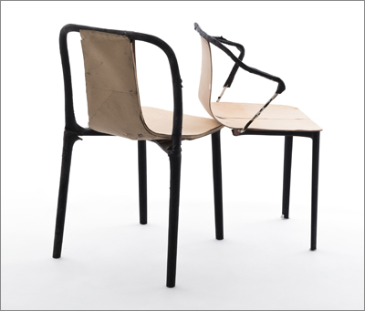
The complete Belleville collection, including a chair, an armchair and two tables ICON: Four years ago Vitra asked you for a light, versatile stacking chair that could be produced in high volume. What was your starting point? Erwan Bouroullec: The early discussions led us to using injection-moulded polyamide. Polyamide is a really high grade of plastic, very strong but at the same time quite elastic. Often, high-volume chairs are made using polypropylene or some sort of polycarbonate. But this was the right combination to achieve these really thin, singular lines. The chair is a hybrid between frame and shell construction. The polyamide frame is holding a lot of pressure; it puts the plywood shell into tension a little bit like a bow. This makes the shell really thin and quite visible.
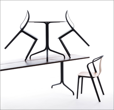
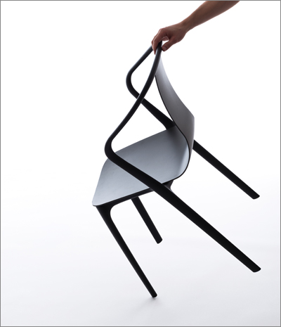
The black armchair ICON: The chair is visually very light but manages to be quite strong in practice. Was this hard to achieve? EB: It’s to do with the separate construction of shell and frame. If we had done a monobloc chair, the frame would have been softer and the shell would have been stronger. I’ve spent so much time valuing every part and I’m happy that the end result has a general thinness – even when upholstered. ICON: How did you design the chair to be appropriate for a variety of situations? EB: In a hotel, for example, a plastic version could be outside, the cafe area could have ones with plywood seats and, if you wanted something a bit more comfortable, you could go with fabric or leather. You have these options with both the chair and armchair. The armchair is quite small and its arms aren’t too long, so it can be used at a table. We made a lot of effort to make this chair suitable for anywhere – to be easy to grab and stack. The early point was to be serious, but the end result gained something else along the way. Ronan Bouroullec: The goal was to produce something like a song, with the ability to go many different ways. Its design is silent enough for historic spaces, but it also has enough beauty and presence to fill a boring white space. It has a certain type of elegance that is not about a wow effect.
Chair and armchair ICON: You chose black for the frame, and the finishes – plastic, wood, fabric and leather – can be coloured. How did you devise these options? EB: First, we decided to link all the structures [including a round and rectangular table] using black. Black is a good choice because it defines a really clear line, it absorbs light and the shape doesn’t become distorted with reflections. RB: I wanted a colour that’s not typical for plastic. When you see the black frame, you could think it is wrought iron, but as soon as you put colour on the frame it starts looking like a plastic chair. Icon interviewed the Bouroullecs at the Leadenhall building last year EB: I see this chair a lot like a font or typeface. It’s designed like a letter. You can spend a lot of time valuing every curve without much need for a concept – you just make it what it needs to be. So, if it’s a letter, black is a colour you can’t really escape. RB: We like the idea of systems, rather than simply arriving at an end point. But with finishes, a lot of the choice is up to the client. Sometimes when I see the result of the mixing, it’s awful. You have to think about that when you do objects that are supposed to exist in quantity and mix. A lot can be done with three coloured plastics, three types of wood and some textiles. So, when you mix them, there can be no mistake with the first range.
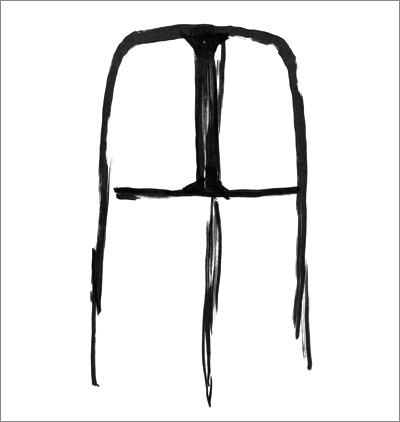
A concept sketch for the Belleville chair ICON: Could you tell me a little more about the ways in which the chair is like a letter? EB: If it were a font, it would definitely be light or ultralight. Another plastic would be a normal weight, or on the bold side. We first called the chair Serif, after the type design with subtle feet. Newspapers use serif fonts because one letter next to another creates a line that has a stabilising effect as you read. Actually the chair doesn’t have those kind of feet, but there have been so many fights over refining those curves you can’t even imagine. We spent so much time on it that, in the end, we had no more ideas for it – we just wanted to carefully carve it. Revisit iconeye.com in the coming weeks and pick up a copy of our July issue, available in early June, for more coverage from Milan |
Words Riya Patel |
|
|
||
|
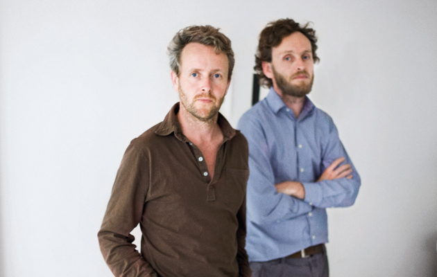
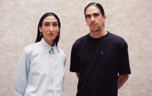
Ronan (left) and Erwan Bouroullec |
||