Penguin design has been in the news a lot in recent years. The company’s 70th anniversary in 2005 prompted much celebratory press, galvanised by the birthday publication of Phil Baines’ superlative Penguin By Design, a thorough look at the publisher’s history up to 2005. And the company was not just being admired for its history. After a couple of decades of drift, mistakes and timidity, it has recently produced some excellent design, particularly the outstanding Great Ideas and Great Journeys series of short books, and the revivified Penguin Classics. On top of this, it has shown a pleasing willingness to experiment, printing a short run of favourite titles with blank covers for readers to draw their own designs, and getting back to basics with a stripped-down series of classics in austere green livery sold for just £2. Other more modern titles have been given retro Jan Tschichold-style covers, an impish move that was more provocative than conservative. It’s bold and cheeky to give Jeremy Clarkson the sober three-panel jacket we associate more with Bertrand Russell and George Orwell, not safely nostalgic.

None of these can be found in Seven Hundred Penguins, a compilation of cover design “classics and oddities”. No covers from this century are included, and there is only a tiny number from the 1990s. “We’re still too close to more recent covers to judge them objectively,” says Jim Stoddart in his introduction.

That would be fine if the rest of the covers in the book had been judged objectively, but they have not. It’s a strange and intensely idiosyncratic collection that wears its subjectivity on its sleeve. Covers were nominated by Penguin staff around the world, who picked personal favourites that were whittled down into a final 700. “What some people like, others hate,” Stoddart says. It’s all relative, it’s all a matter of taste.

The only unifying characteristic of the covers is that they are meant to be “memorable”. Perhaps, but memorable to whom? The 1985 Penguin Dictionary of Computers has an utterly forgettable, in fact downright ugly, cover, but perhaps it has special significance to one of the team at Penguin New Zealand.

The decision to ignore recent covers is a missed opportunity for Penguin, considering their quality, and doubly odd given that Baines included the recent Great Ideas series in his book two years ago. The early years of the company, and Jan Tschichold’s seminal tenure as head of design, are also deliberately under-represented, apparently to make room for variety. What we’re left with is a lot of covers from the period 1950 to 1989.
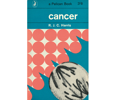
This was the best of times and the worst of times. The 1960s are the years of Germano Facetti, Romek Marber and Derek Birdsall. Facetti’s years as head of design showed that the serious and highbrow could be designed accessibly and freshly, and that the popular could be designed seriously and intelligently. Photography, then unstoppably ascendant in book cover design, was used cleverly alongside graphics and illustration. Marber’s Crime covers are often photographic but remain abstract. They’re very atmospheric, creating a mood of mystery without being literal or obvious. In Education, Birdsall went in the opposite direction, using extreme literalism to be witty: a dime represents poverty, an unused piece of chalk means a new teacher. And Facetti himself is always surprising, bringing out unexpected details from old paintings to illustrate Classics and putting together inspired blends of graphics and stock images, for instance on the 1965 Pelican edition of Jane Jacobs’ The Death and Life of Great American Cities.
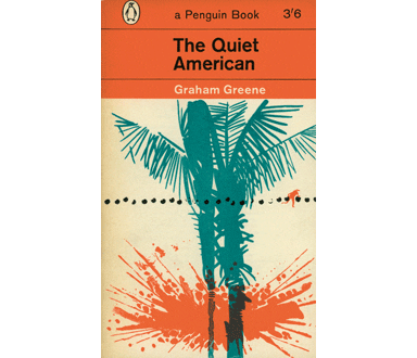
Importantly, however, the Facetti era was consistent – each cover stood on its own, but it was also recognisably part of the visual branding of each imprint. Then it all went horribly wrong. Good design does not mean good sales, it’s a luxury that gets ditched when the commercial climate turns chilly. In the 1970s Penguin’s sales were struggling, and the company largely abandoned grid discipline and typographic consistency to get the tills ringing again. The result was a glut of garish film and TV tie-ins, and a distressing amount of general schlock.

Take, for instance, the cover of A Puzzle for Pilgrims, produced by Penguin Crime in 1985: a vulgar and sensationalist sexy-corpse photo surmounted by a chaos of four or five battling typefaces and a title in Barbie pink. This isn’t an isolated instance of ugliness in Seven Hundred Penguins – there are dozens like it from the 1970s and 80s. If some of these covers are considered memorable, it’s not because they are attractive or have aged well – it’s the kind of traumatic memory that might be overcome with careful therapy.

These lists are always magnetic, even if one strenuously disagrees with the content. That’s why the TV schedules are full of them. But what makes this one uncomfortable is the sense of embarrassment around it, from the defensive notes struck in Stoddart’s introduction to the almost masochistic inclusion of some terrible covers – and the downplaying of Penguin’s early greatness and recent return to form. Be subjective by all means, but don’t succumb to this relativism that looks suspiciously like affirmative action for the ugly.
Seven Hundred Penguins, Penguin Books, £20
www.penguin.co.uk


