

words Chris Hall
“Peter Saville drives a Skoda.” The appalling idea scared him off of renting one when it was offered in place of the VW Polo that he’d ordered. “I know everyone says they’re really good cars now, but I’m not gonna be in a test group for them. It’s still a Skoda,” he says, terrified that people would think he drove one.
Instead, Saville pulls up at his studios near Old Street, East London in a rented Fiat Stilo, the Doors still playing on the stereo. His own car, a 16-year-old BMW 3 Series, is in the garage and he hasn’t quite got used to the replacement, checking and double-checking that he’s properly locked it. He’s worried about how much the repair bill is going to be when he collects the BMW. In fact, he’s worried about bills full stop.
He has a big tax bill to pay this month, which he says he can’t afford. The bailiffs have been round, who he fended off by lying to them, and the phones have been cut off. Plus his own financial involvement in The Peter Saville Show which opened in May at the Design Museum in London, and a book published by Frieze, has meant that he’s on the verge of personal bankruptcy. Oh, and he’s just about to be kicked out of the house he’s been staying at in West London for the past two years and might have to move in to his studio which hasn’t got a toilet. Or blinds. Or a bed.
You wouldn’t think that this was the same Peter Saville who’s designed some of the most original and iconic album covers ever with Joy Division, New Order, Suede and Pulp; who’s worked for Christian Dior, Givenchy, the Pompidou Centre, EMI and Selfridges, among many, many others; whose seminal work for fashion designer Yohji Yamamoto has influenced a decade of “anti-advertising” advertising, and who’s been recently voted the “most admired individual working within the creative industries” in Creative Review. The Peter Saville who’s been quietly amassing an impressive body of work as a graphic artist over the last 25 years, who at the age of 47 is being officially recognised by the mainstream.
It’s the weekend, which means he’s working, and he’s arranged to do some quick picture editing with one of his colleagues, Sascha Behrendt, just before he meets me. But he’s running late, so they have to look at the prints of a shoot he did a few days earlier for Stella McCartney while I’m there. He’s dressed in his trademark white Helmut Lang jeans, a black T-shirt and some tan leather shoes (no socks). He speaks in a soft Mancunian accent deepened by nicotine, and has a distinctive sustain when pronouncing his Rs. Saville puts on his black-framed glasses and goes over to the table to look at large-format Polaroids of Kate Moss in knee-high leather boots. “The professional situations I have at the moment are really quite abusive,” he says matter of factly. “It’s not a straight, commercial relationship I have with my clients. They come to me for something special, and yet for the most part they know that they can get it cheaply and they do, and that offends me. But I have to take what’s on offer.”
He has his lunch at 5pm; a solitary sausage roll, which he’s eating from a large white plate with a knife and fork. What about all these flash restaurants he’s supposed to go to all the time – I thought it’d be a take-out from Claridges or something? “I go to the Ivy about once every two months, despite what’s been written,” he laughs. “I spend about £20 on a meal.” He goes off to the kitchen area of his white-floored and white-walled studio space every so often to make himself an espresso in his Richard Sapper stove-top, making sure that everything is left clean and tidy.
He mentions that he is going to watch the Monaco grand prix the following day and has been following the qualifying sessions. With his understated elegance and slightly egotistical charm, he could be a poor man’s James Hunt. “Yes, there is some of that going on,” he admits, a little embarrassed by this particular reputation, but he’s more interested in moving from talk of playboy to Playboy: “I’d like to redo Playboy magazine. I find it lamentable that there isn’t an intelligent, erotic magazine. There isn’t a magazine that was like Playboy was 30 years ago, and I find that… dumb. Why isn’t there any intelligent, abstract eroticism? I can find the artist Lucio Fontana’s colour fields incredibly erotic juxtaposed against a bit of Rocco Siffredi [a porn star].”
From 1978 to 1991 when he was art director at Factory Records in Manchester (which he co-founded with Tony Wilson and Alan Erasmus) he had carte blanche creatively. He designed the posters for the legendary Hacienda nightclub in the city, the album covers for the Factory bands (Joy Division, New Order, OMD, etc) all seemingly quixotically free of financial considerations. His artwork for the cover of New Order’s Blue Monday 12 inch in 1983 was die-cut to make it resemble a floppy disc, and, depending on whose version of events you believe, cost the record company anywhere from 2p to 75p everytime a copy was bought. Which perhaps would have been fine had it been a limited edition, but it just happened to become the biggest selling 12 inch record ever. “What I did in my local zone was how I wanted everything to be,” says Saville. “I was spoilt in the beginning by being given a big playground to play in and remarkable freedom.”
The very first poster that he designed for Factory with its “Use hearing protection” strapline, along with the architect Ben Kelly’s design for the Hacienda (which Saville collaborated on), foreshadowed the industrial warehouse chic that would come to dominate interior design in the following couple of decades. (After noticing recently that the originals were fetching £1,500 on eBay, Saville decided to produce 500 re-editions of the FAC1 poster which will cost £100 each. But how much this is motivated by the horror that it’s out of the reach of the masses, and how much by what must be a fairly easy income generator, is hard to say.)
With Blue Monday and the earlier New Order album Power, Corruption & Lies there was an interest in coding the work, so that the titles were spelt out in colour. He pushed this idea further with later albums. With New Order’s Brotherhood (1986) and Technique (1989), it was clear whose work it was from the enigmatic, restrained and visually innovative sleeve design, respectively a sheet of Titaanzink metal and a Warholian cherub.
One of the persistent legends that attaches to Saville, is that, like the author Douglas Adams, he loves the sound of deadlines whooshing past. Stephen Morris, the drummer of New Order, confirms this, recalling Saville’s most infamous late delivery. “It was the programme he did for us on an American tour that turned up on the last gig, and we’ve still got 1,000s rotting away in a warehouse somewhere that we can’t get rid of.”
But Brett Anderson, the lead singer of Suede, forgives Saville’s tardiness. Anderson is a friend of Saville’s and worked with him very closely on their albums Coming Up and Head Music. “A lot of it was done sitting and chatting and drinking coffee. It’s a real exchange and a discussion. It’s all part of his charm. What you miss with deadline efficiency is made up for by the incredible level of personal care he takes in the work. He really immersed himself in the music. He’s not driven by money or fame, just a genuine quest for aesthetic beauty.” Saville is currently working with the photographer Wolfgang Tillmans on Suede’s greatest hits cover, due for release in September.
Because of his concerns to get a job done right, Peter Saville and business have long had an uneasy relationship. “There’s no notion in any industry that they will wait for graphic design. They will not wait. They’ll spend longer negotiating your work-for-hire contract than giving you to do the job!” he says with rising incredulity. “It’s just the finishing, but it’s in the finishing that you make it or break it.”
Does he think that his deadlines are unrealistic? “They are if you want something resolved or of any quality,” he says. “My problem comes when it’s my work. I become territorial, and self-indulgent and maybe arrogant. If it takes till next Friday, it’s gonna take till next Friday. You know, I had this mistaken understanding of professional when I was younger that it meant being really good.” He laughs in cynical astonishment. “But it’s actually about doing what has to be done within the circumstances within which you are allowed to do it.”
The way Saville tells it, his designs have actually influenced the music. He claims that the musical direction of what was to be Joy Division’s final album, Closer, was guided by its funereal sleeve photograph by Bernard Pierre Wolff (the lead singer, Ian Curtis, hanged himself shortly before its release). But Morris, who’s currently in the studio writing songs for New Order’s next album where they recorded the ambient music for the Design Museum retrospective, is having none of it. “I think that’s too strong, but not for Peter,” he says, laughing fondly at such hubris. “I remember him and Rob Gretton [New Order’s former manager] having a discussion and the upshot was that Peter said people bought the records for his sleeves, not for the music.”
“I come to every new job as if it’s Everest to climb again,” says Saville, lighting up the next of many, many Gauloises. “I foolishly approach everything as if it’s really important and that it has to be done, in some tiny way perhaps, in a way that it hasn’t been done before. I won’t just repeat myself. I don’t know why I do it. Partly it’s about anxiety and fear. Partly it’s about the music business where people would want something completely different.”
He comes across as a perfectionist, utterly disillusioned with big business, confused by his being in a grey area where art meets design and wanting to break free of his financial bonds and take a new direction. One can’t help but feel that with the kind of reckless candour with which he talks about the shortcomings of just about every client he’s ever worked for he’s trying to talk himself away from commercial art through autosuggestion. Icon’s photographer, Jamie, met Saville a few days earlier and was taken aback: “He was unable to resist art directing himself in the local playgrounds and parks. And I was amazed at how open and warm he was.”
Saville clearly has a lot of steam to let off. “Absolutely everything except the creative act is stretched out as long as is needed and there’s this notion that you can resolve the creative issues and problems [clicks his fingers] like that… the bigger the budget the more people sign-off, the more bland and generic it will be. No one wants to take a chance. I mean, what is happening in car design? It’s either hideously bland or really quite perverse.”
The record industry was only ever going to be a professional cul-de-sac for someone fast-approaching 30, and Saville seems more savvy than Machiavellian when he says that he “learnt quickly how to manipulate the record industry to my own ends. I took a selfish, bloody-minded approach to the work and I made life hell for the people who were paying for it. To me the work was going to be my passport out of it.”
With Peter Saville Associates in financial crisis and Factory Records on the verge of collapse, he finally hit commercial reality in 1990 and joined the Pentagram group in LA as a partner. With Saville’s odd working hours – he rarely gets up before the afternoon and works until midnight – and his antipathy, not to say hostility, towards corporate till-ringing, the relationship was doomed from the start. “I just will not make this analogy between what I’m being paid and how much time we spend on it. It gets as much time as it needs.”
The current interest in Saville has a lot to do with the demographics of the creative industries. There is a whole generation who grew up as fans of, in particular, Roxy Music, Joy Division and New Order, who are now making the decisions. “When I first met the president of Givenchy Parfum,” says Saville, “he said ‘Oh, Monsieur Saville, I am a fan of Joy Division, I am a fan of Peter Saville.’ I was 45 and he was 39.”
And it wasn’t just with couture fashion. “Throughout the Eighties I saw the High Street convert. At Next, I saw so much of what I’d done for Ultravox. It was everywhere.” He explains: “At the design firms, the grown-ups weren’t hands-on anymore and the work was left to the kids.”
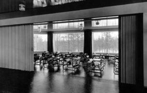
At the Design Museum retrospective (designed by the architect Lindi Roy), Saville’s work is arranged chronologically. The middle section is very dark, and shows his catalogue and advertising work for the fashion designer Yohji Yamamoto. The Game Over series of photo library stock images from 1991 – for Yamamoto – captures the sense of consumerist exhaustion and overkill amid an impending recession, which has been much copied in terms of its abstraction and typography. A Guide To Never-Never Land adumbrates the future of advertising in the 1990s, where the product is so far off the page that it almost becomes anti-advertising advertising. A car production line, all flashbulbs and gleaming surfaces, stretches off into an infinite hell of consumerism, as much a break with reality as Saville’s image is from Yamamoto’s clothing.
When he’s talking about the retrospective, it seems as if Saville’s incapable of letting go and trusting his work to others. “I’m unhappy towards the people who I do the work for,” he says. “That’s my mood right now, which is kind of ironic after what would appear to be a successful show and book. It’s not what you would imagine. No one has gathered a comprehensive review of the work done by Peter Saville Studios over 25 years and looked at it in order to write about it or curate a proper show for a museum. Nobody. Has. Looked. At. The Work.” He says that the Design Museum exhibition lacks context, that there is nothing explaining why the work is important. And when he says that the show is his “greatest hits”, he means it pejoratively.
Although he sounds exhausted by the demands of running his business, he talks hopefully about the future. There is the Pirelli calendar that he’s working on with the photographer Nick Knight, a long-time collaborator, and which, despite being “a bit cheesy”, has kept his interest. A project he’s working on for the software company Adobe and its Photoshop packaging neatly ties in his attraction to recycling and to reflecting contemporary ways of living. In 1998, he started to experiment with the Wave filter on Photoshop and found that he could produce stunning digital paintings with all kinds of imagery, starting with New Order covers. “What’s interesting when we make the Waste Paintings is that we don’t know what’s going to happen, and that’s fascinating. We did one last week and it was mindboggling. We did it for the Adobe project. If I could work a computer, I’d show it to you! It’s beautiful. Print it out – it’s done.”
Saville has spent years agonising over a context or concept in which to place his many boxes of notebooks full of thoughts, sketches and ideas. “I was interested in the industrial estate, the country estate – different ways of understanding the word estate. It led me to ‘Estate of’. I though, shit, if I retire or die what will someone do with all of this stuff that I haven’t been able to work out? They’ll put it all together and they’ll catalogue it, and flog it. I thought, well why don’t I?”
It would appear to have opened up possibilities for the graphic designer to move forward with his work and at last untie himself from those abusive client relationships. “A few years ago I was giving myself a hard time about not being an artist because what is it that I do regardless of other things? And then I realised – oh, I do this [the notebooks]. I’d done the work. I’d been filling notebooks for 10 years about the things I ought to do – preparatory notes. I’d done the work, but I’d never thought about it as writing it.”
This is the big project, after all the hassle with clients and the financial frustrations and worries of his studio work, that he wants to do next, with himself as client: “I’ve learnt not to leave this kind of thing to chance.”
Designed by Peter Saville (Frieze), £19.95