words Adrian Shaughnessy
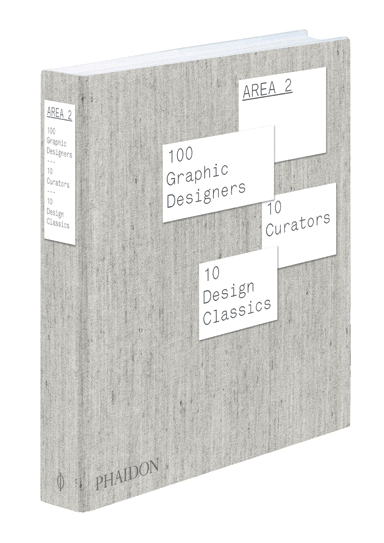
Gluttony is an ugly word. But if you want to fur your arteries with a sumptuous feast of graphic abundance, then here’s a book to bury your head in for an hour or two. You will emerge exhausted, but droolingly sated. It’s a follow up to Area, published in 2003, and like its predecessor it’s a hefty compendium of new and compelling graphic design. There’s hardly a dud note struck in 448 pages. Ten curators (all practising designers or art directors) have each chosen ten practitioners, each of which has been given four pages to display their wares. If you want to know what’s hip, smart and fresh in international graphic design, here’s a surefooted guide.
What’s more, we are presented with a non-tokenistic attempt to show graphic design as a global phenomenon. If work is included here it’s because it’s good, and not because political correctness demands a representative selection. It’s one of the many benefits to be had from asking graphic designers and art directors to choose: no one is going to jeopardise their reputation by nominating second-raters no matter where they come from. Graphic designers don’t do equal opportunities when it comes to their trade: it has to be good.
The result is a fizzing cocktail of work from Asia, Europe, Japan and USA, but also from Brazil, Cuba, Korea, Iran, Israel, Mexico and Nigeria. Yet despite the welcome inclusion of work from nations not normally associated with the canon, if this was the design equivalent of the Eurovision Song Contest, I predict an easy win for the Netherlands. Again and again, it’s the Dutch design that stands out. The sheer graphic energy of the Dutch entries is all conquering. There’s work from a host of names – none of them well-known outside Holland: Julia Born, Vanessa van Dam, Hansje van Halem, Bob van Dijk, the quaintly named Typographic Masonry, and (new to me) 75B, whose logo for Rotterdam City of Architecture 2007 shows what London 2012 could have been.
Non-Dutch names that catch the eye include Büro Uebele (Germany), Henrik Nygren (Sweden), Paul Cox (France), Theseus Chan (Singapore) and Enlightenment (Japan).
But once you’ve recovered from the sugar rush of visual pulchritude, two questions linger. The first is a question of definition. What are we looking at here? Viewing this book, it’s as if the old illustration/graphic design divide has become irrelevant. It appears that we’ve gone full circle, and we’re now back in the 1960s when Push Pin showed that illustration and graphic design could be melded into a single discipline. There is, of course, plenty of work included that is strictly graphic design, by which I mean work that is largely typographic, with the controlled and formalistic use of photography, illustration and graphic elements to deliver a message. Yet many of the shapes, images and graphic effects are used in a way that can only be described as expressively illustrative.
The second question is a more serious one – at least for the craft of graphic design as a whole. Flip through these pages and you’ll find work that is largely from academia, art publishing, music and the cultural sectors. There isn’t a single piece of quotidian design – no supermarket packaging, no High Street merchandise, no corporate communications. I’m not saying that there should be. After all, who’d buy a book full of run-of-the-mill, jobbing graphic design? But it does pose the question – if this is the best (and I think it is), what about the rest?
So let’s be clear. This book allows us to take the temperature of global graphic design – but only a tiny sliver of it. And when we wipe the drool from the elegantly designed pages, we should remember that it’s not all like this.
Area 2 is published by Phaidon Press, £45
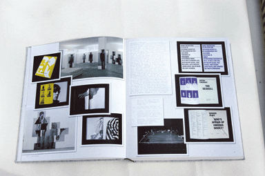
A spread showing the work of Dutch designer Julia Born


