|
|
||
|
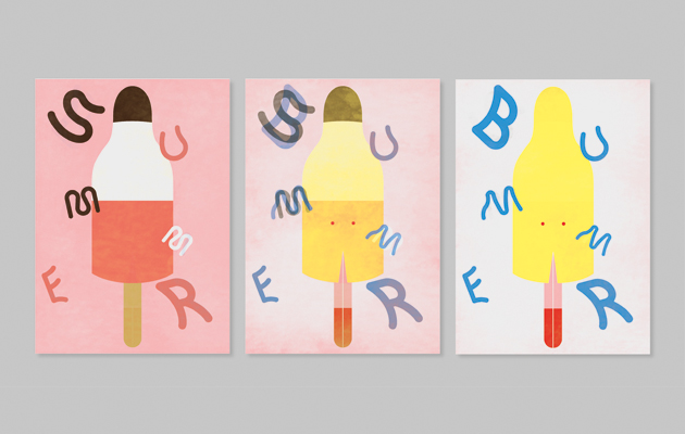
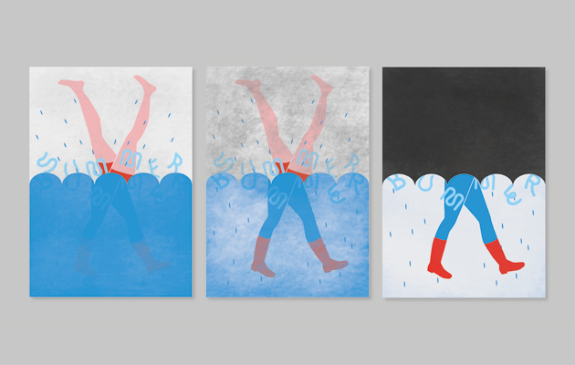
The way that summer is branded is all wrong, over-stimulating us with exotic notions like sunshine and barbecues. Bob Design tells it like it is … It was a particularly grey summer’s day at our London studio when Icon asked us to come up with something that we felt could do with a rethink. The dictionary definition of summer is ‘a period of hot, usually sunny weather’. At the time, our Swiss studio were teasing us with their plans to go swimming in Lake Zurich at lunchtime. As a result, we unanimously decided to rethink the British summer, so we can understand objectively how to recognise summer here, and find a way to manage our expectations. Identity Summer and winter are represented as polar opposites in Britain. Christmas provides a clear brand for winter; summer on the other hand seems a little confused – palm trees, piña coladas and tropical fruits adorn the products on our supermarket shelves. The way we understand summer is largely based on products from warmer climates. To address this, we propose a flexibrand: a responsive identity that can react to both rain and shine. It will play on the unpredictability of the British summer and identify possible scenarios.
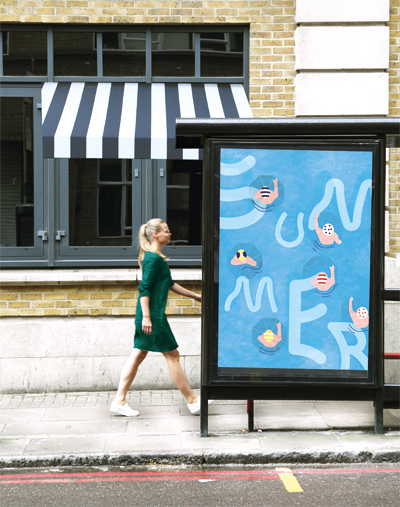
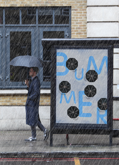
Through their careful use of hydrochromatic inks, the posters change on contact with rain Rolling out the identity We chose a poster campaign to demonstrate our new identity, as it can be placed outside in the midst of the famous British weather. These posters would be printed with hydrochromatic inks that disappear when touched by water. The posters therefore change according to the weather, revealing an appropriate aspect of summer depending on when and where they are viewed. Typography We chose the font Zigzag Rounded designed by Benoît Bodhuin. This has three variants for each glyph, which let us mix these alternatives in order to express the flexibility of our new brand. |
Words and images
Above: A poster campaign places the new identity firmly in the context of the British weather |
|
|
||
|
|
||

