|
|
||
|
With its vibrant culture and tumultuous, divided history, the German capital has many identities. Can they be unified in a single logo? Berlin seems to be so trendy, contemporary and cool, but its visual identity is quiet, characterless and really rather old-fashioned. Of course, there are lots of great cultural events, and these often have impressive corporate identities. Some are intimately connected to the city, which may be why the perception persists that Berlin has a strong graphic identity.
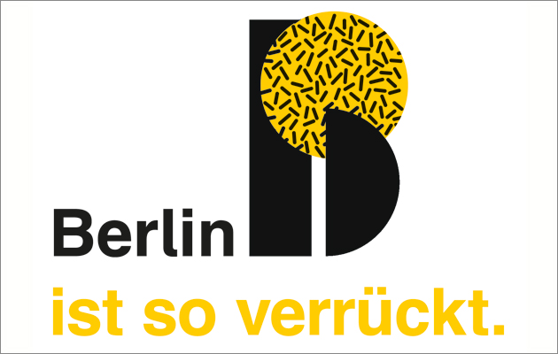
We feel that Berlin needs a visual identity, and it should be simple, universal and flexible. Any new signage system needs to recognise that Berlin is not just a town – it is a label, a brand. Berlin stands for so many things, politically, culturally and historically. It is a challenge to encompass all of these aspects, so the best route is to keep things straightforward and comprehensible, so that the proposed solution can be adjusted for a variety of different environments and purposes. In short, Berlin needs a logo. The name Berlin is known and understood in almost every country and language. And the letter B is a very distinctive one – just right for a vibrant city such as Berlin. To make it more abstract, and also to create something unique, the B should be transformed to a classic logotype that pays homage to the city’s associations with the Bauhaus.
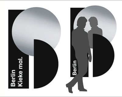
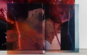
A 3D mirror installation for a public space. The line, in Berlin dialect, invites visitors to “have a look”
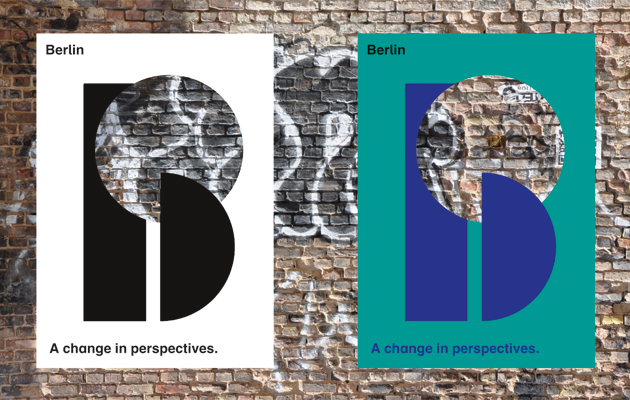
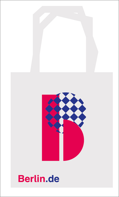
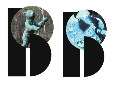
The Element can be filled with abstract images or photographs to convey a specific message The form of the lowercase B can be transformed into an uppercase character with the addition of only one element, so we’ve used this additional shape – the “Element” – to provide a second layer to the logo. This can be filled with abstract or pictorial images, which work to support the message required in any particular circumstance. This is a modern approach to providing an identity for Berlin – the Element attracts attention, and provides a practical and metaphorical platform to showcase the diversity of the city. The two parts of the logo also interact, working together and becoming a single entity. |
Words and images
Above: The “Element” can be cut out of posters, enabling real and printed surfaces to interact |
|
|
The logo needs to be flexible to support a wide range of possible applications. Here it is used alongside a line: “Berlin is so crazy” |
||

