|
|
||
|
Why do albums by female singer-songwriters so often resort to bland, photoshopped portraits? Steve Hockett, director of Wonder Room Studio, proposes a more honest approach One of the first things that drew me to graphic design was record-shopping as a kid. Leafing through the racks and picking out stuff by how much I liked the cover and what it said to me visually. Taking it home and copying the typography of the band’s name on endless sheets of paper, on my pencil case and even on my arm (concealed under my school sweater of course), pretending it was a tattoo. I rarely stray from the alternative sections these days but it often seems to me that, when it comes to more mainstream records, the choice of artwork is one of safety, using the accepted choice of image and typography for a particular genre and maintaining the status quo to ensure you don’t confuse or alienate your audience. It’s a sales-driven aesthetic.
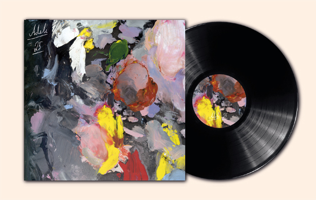
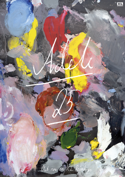
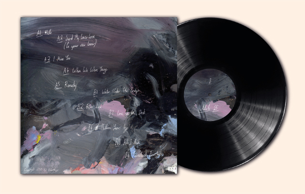
The artwork for the new Adele album follows exactly that way of thinking, slotting perfectly into the female singer-songwriter category. A simple, pensive, black-and-white portrait adorns the sleeve. At first glance it seems natural and honest, but when you really focus on it, it’s the opposite: staged, made-up, photoshopped. It’s really successful, of course: it’s well executed and you can’t deny those sales figures (it sold more copies in the first two weeks than anything else, ever), but for me it’s a missed opportunity, and it made me wonder what it would be like if I had free rein to work on it. I liked the idea of trying to create a more honest portrait, painting and working by hand to create something more real, showing evidence of the artist’s hand rather than removing all traces of it. I started thinking about different ways to approach portraiture and remembered seeing Ryan Gander’s Self Portrait series. The actual paintings are never shown – instead Gander exhibits the palettes he used in creating them. With this idea in mind, I’ve presented these abstract workings in all their glory. The result is a somewhat deconstructed version of a portrait – its raw elements, the true colours. I can’t tell you if it would affect Adele’s sales figures, but who cares. At least that top ten section might look a little more interesting. |
Words and images Steve Hockett, Wonder Room Studio
Images: Hockett’s cover is inspired by Ryan Gander’s Self Portrait series. Rather than show the actual paintings, Gander exhibits the palettes used to create them |
|
|
||
|
|
||

