
Words Justin McGuirk
This building treats the law like a game. A zoning regulation from 1916 makes Manhattan’s towers step back so that the streets can have light. It took nine decades and two outsiders to subvert that rule.
New York took the ancient form of the ziggurat and gave it the industrial thrust of the machine age. But we live in a different age now. The boxes that make up the New Museum of Contemporary Art, designed by Kazuyo Sejima and Ryue Nishizawa of SANAA, have none of the upright certainty of the skyscraper – they look as though the overgrown infant who stacked them might just as carelessly knock them down again.
The New Museum is a long way from Fifth Avenue’s Museum Mile, and a fair hike from Chelsea’s gallery ghetto. As the first museum to be built downtown, it has boldly opted for cultural isolation. But the New Museum can afford to be bold. Since the uprooting of the Dia Art Foundation and the stultification of MoMA, this is the only institution in the city offering a flexible space for contemporary art outside of the commercial galleries. In temporary digs since it sold its Broadway home four years ago, it can now take its place as New York’s foremost kunsthalle.
As you approach the museum along Prince Street, you leave chichi SoHo behind and enter the much edgier – insofar as anywhere in Manhattan is edgy anymore – Lower East Side. In fact, the museum is on the Bowery, a street with a formerly rough reputation, between the Sunshine Hotel (a Skid Row flophouse) and The Mission (a hospice for the homeless). Gentrification never had a more compact case study than this block. As though the building needed it, the metal skin lends it a certain toughness, but that would seem to be a by-product of a different local reference. Today, the Bowery sells industrial kitchen equipment, and the pavements and shop windows are lined with stainless steel sinks and counters. With its facade of expanded aluminium mesh, the museum feels right at home.

Clearly, with its jutting, toothed silhouette, the building is intended to be a landmark. It is eminently reduceable to a logo, and, on the day we meet, project architect Florian Idenburg is wearing that logo on a badge on his lapel. The structure is twice as big as any of its neighbours and yet it doesn’t feel big because it has been broken up into manageable boxes. It is, in fact, strangely scaleless. With few visible windows and no exterior details, it’s a cipher. What it makes reference to most obviously is the city itself. Looking up the Bowery 30 blocks or so you can see the Empire State Building; look south and you see the residential tower of Confucius Plaza. At seven storeys high, the museum is far from being a skyscraper, but it makes a very tangible connection with the city’s skyscraper stock.
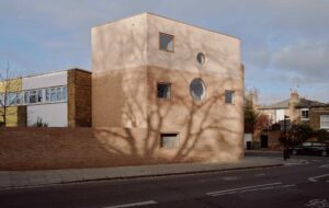
The precursor of this building is actually a little house in Tokyo – Sejima’s Small House. There, the architect shifted the three storeys around to squeeze them into an awkward site and then – a couple of years before OMA did this at the Seattle Library – enveloped them in a diagonal skin. Here, SANAA has shunted the boxes around for different reasons. The architects wanted to distinguish each gallery as a box. The formal advantage to this is that it reduces the impact of the entire volume and evokes a tower with numerous setbacks. It steps back from the street five times, as though it soars much higher than it does – when regulations only required one setback. On top of this, the boxes dance from side to side around the structural core. In practical terms this allows room for skylights at the top of each box so that the galleries can enjoy some daylight.

SANAA buildings are like lenses. The 21st Century Museum of Contemporary Art in Kanazawa and the Glass Museum in Toledo make a great show of their transparency and porosity. By contrast, the New Museum is closed and inscrutable – in the daytime, even the one window on the front facade is disguised by the aluminium mesh. The significant exception is the ground floor, which is an archetypal piece of SANAA space-making. The building meets the street with a simple glass front that exposes the interior without any of the architectural fanfare that might announce the entrance of a culture palace. Anyone can walk in and visit the bookstore or cafe, both of which are in the lobby. And since everything is open plan, you can stand in the small gallery at the back of the room and still see clear across the Bowery. Moreover, this sense of openness extends to the museum’s workings. As the building can only be entered from one side, everything comes in from the street, which means that what is usually back-door stuff such as the loading of artwork into the elevators will always be on show. And as a museum with no permanent collection, that’s a lot of to-ing and fro-ing.

As you’d expect of a SANAA building, the interior is a monastery of refined industrial minimalism: concrete floors, ducts and services are exposed behind mesh ceilings, and every wall is white (unless it’s glass). But again there are exceptions. The toilets are a riot of bright orange mosaic flowers, and the elevator doors open to reveal an acid lime. It’s good to see colour being used with a sense of humour, and a relief to see that SANAA’s ascetic rigour is not rigor mortis.
Upstairs the transparency continues. In the offices on the fourth and fifth floors, the diagonal beams that provide the building’s structure are exposed in a casual and unsymmetrical way. Sprayed in a fire-retardant foam, they have a blobbiness that makes them almost like upholstered pieces of furniture.

Meanwhile, the galleries are… galleries. Which is to say white cubes. However, there is a narrative to follow, if you look closely. As you rise through the building from the first floor to the third, the galleries get smaller and the ceilings get higher, so that you’re vaguely conscious of a tower attenuating. But if you notice the position of the skylights, which shift from the north and south sides of the galleries to the east and west, you can follow how the boxes themselves are shifting. And one lovely detail worth pointing out is that on the first floor the shape of the skylight reveals that the room is actually not square. This is simply because the facade fronts onto the Bowery, which is one of Manhattan’s diagonal avenues. So from within this sterile cube you can feel that you’re deviating from the faithful but relentless grid.
Of course, no one will notice these things, not when there’s art to look at. But there are other features that are much more dramatic. Chief among these is a narrow stairwell that connects the first- and third-floor galleries behind the elevator shaft. Looking down from the top, it’s a precipitous piece of minimalist theatre, whereas from the landing you have a choice of views. One is out of a window onto a traditional New York tarred roof (that of the Sunshine Hotel); the other is up a chimney-like exhibition space appropriately called The Shaft. This is an unexpected space nine metres high with a sturdy hook at the top.
However, the museum’s prize spot is the balcony on the sixth floor, which wraps around the southern and eastern edges of the education space. From here, not only can you enjoy the aerial drama of the city, but you can appreciate what a rare building this is. Looking due east, you can see two new buildings that represent the state of contemporary architecture in New York. One is an ugly blue condominium slab by Bernard Tschumi and the other is the Rivington Hotel, a mess of a glass-and-steel tower. And along the West Side Highway, which you can’t quite see from here, are any number of residential towers by world-famous architects all testifying to one fact: the world’s most famous architects are doing their worst – or at best their dullest – work in New York. Somehow, the developer culture gets the better of everybody. Granted, this is a cultural institution, with different pressures, but then so was MoMA, and it opted for the deepest conservatism. The New Museum, at least, feels new. More than that, it’s the most exciting building to go up in this city for years.
SANAA’s tower is symptomatic of a self-consciously clunky sensibility taking hold of architecture. Once upon a time it would have been thought laughably inelegant. But now that every disciple of Rem Koolhaas is exposing and distinguishing the functional elements of buildings – the chaotic pile of towers that is REX/OMA’s Louisville Plaza is the quintessential example – inelegance has become its own aesthetic. This building, however, is highly refined.
What’s interesting is that you can tell that this is a museum of contemporary art. What else could it be? It’s like a sign. It even has a kind of modernist functionalism: it’s a stack of white cubes. The inside is plainly readable from the outside. If you know, as the culturally literate – the elite, let’s say – do, that the frame of contemporary art is the white cube, then the relationship is clear and rational. But having raised modernism’s centre-parted head, we need to smash it. Because I would argue that this is, in fact, a piece of postmodernism. It is perhaps the first piece of postmodernism not to plunder pre-modernist history but to take modernism itself as the subject, and to make a kind of joke of it. Not since Philip Johnson’s AT&T building has the skyscraper form been subjected to such gentle subversion. And it takes a certain sophistication – a Japanese level of refinement – to be both minimalist and playful.
images Floto+Warner


