words Emily King
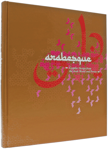
Every graphic design compilation tells a story. Thankfully this one is a little more adventurous than most. Not satisfied with surveying their immediate peer group, Ben Wittner and Sascha Thoma of the German design group eps51, in collaboration with Nicolas Bourquin, have ventured off home turf and taken on the mapping of a fascinating area of graphic design practice that is under-explored in Europe and the United States.
In 2003 Wittner and Thoma travelled to Egypt to design a website and posters for Cairo’s celebrated contemporary art gallery Townhouse. They were inspired by the work being produced by local designers, and the general graphic richness of the city. With the aid of the Khatt Foundation, a non-profit organisation devoted to promoting and improving typographic design in the Arab world, they put together this book.
The collection compiled by Wittner, Thoma and Bourquin includes elegant posters from Iran by designers including Majid Abbasi and Iman Raad; rougher-edged, more expressive work from Egyptians, for example illustrative pieces from Ibrahim Eslam and Equinox Graphics; functional Arabic typefaces, such as Koufiya by Nadine Chahine; and highly decorative, Arab-inspired work by European designers including Jonathan Barnbrook and Richard Niessen. Although extremely diverse, this body of work is united by an underlying concern with the Arabic letterform, a typographic thread that runs across every page.
Unlike so many global design books, Arabesque goes well beyond the professional associations and escapes the boring parade of packaging design and branding. The downside is that, unless the work is as straightforward as a poster or a typeface, it is hard to understand its original context. To an extent the publication is a sketch that the reader can fill out themselves. I have only just begun to explore the websites of the various designers included in it and already I feel dizzy with images and information.
Similarly, the opening essay by the director of the Khatt Foundation, Huda Smitshuijzen AbiFarès, is a Chinese box of a text. Touching on a huge range of subjects including the history of calligraphy, the forces of technology and globalisation, the Islamic prohibition of figurative art and the influence of the East on the West, just about every sentence could be the cue for extensive research and debate. But, taking this line, I feel I am criticising the book for being too interesting, which has to be wrong. To its credit, Arabesque is able to pinpoint a particular issue, the problematic relationship between Arabic calligraphy and Arabic typography, and create a convincing case that digital type must escape the expectations created by the handwritten letter.
Apart from the essay, the book contains ten short interviews with practitioners from across the region. These touch on a wide range of issues, many of them political. But politics are largely ignored in the book. Thoma justifies this approach in a short film that can be viewed on the publisher’s website, arguing that the aim was to emphasise normal life above politics.
Yet politics are part of a normal life, not just in the Middle East, but in the West too. They influence where and how you work (the majority of the designers included in Arabesque are based in Egypt or Iran). I would be particularly interested in the situation of women designers, of whom there are several in the book.
That said, Arabesque is the better for not taking the “typography in the danger zone” route – much better that it is a credible and visually exciting starting point for exploring the graphic design of the Arab world and Persia.
Arabesque: Graphic Design from the Arab World and Persia, Die Gestalten Verlag, £33
www.gestalten.com
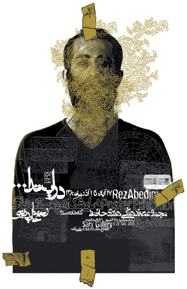
Poster design by Reza Abedini
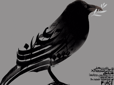
Poster design by Mehdi Saeedi
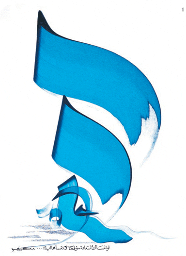
Typographic art by Hassan Massoudy

